N1ghtterrors
N1ghtterrors
designed and built a full-stack storefront for n1ghtterrors
Timeline
3 years
Role
Photographer Videographer UX Frontend, Vanilla HTML/CSS Backend, Node.js / Express / Supabase / Stripe Product Designer Printer Graphics
Team
Failenn Aselta Jason Goodman Sydney Lovro Mo Rader Peggy
Tools
Visual Studio Code Gemini Resend Supabase Express.js Stripe Vercel Vanilla HTML/CSS Node.js
PROJECT OVERVIEW
Design and ship a website for a clothing line that speaks to its edgy essence.
N1ghtterrors is a clothing line rooted in sublimity — each garment is a visual meditation on unseen instability, juxtaposing extremes of power and collapse. I designed the site, coded the full stack, and shot the photography.
The challenge
N1ghtterrors' unique and raw style needs a website that further speaks to the brand collective it has created.
THE RESEARCH
Target User
Participant
Isabella
21 Years Old
Environmental Studies Student
Portrait generated with Gemini
Frustrations
- The site feels intentionally chaotic, but key controls (menu vs cart) aren't equally discoverable.
- The typeface matches the brand, yet long reading moments become tiring without clearer hierarchy.
- Unconventional interactions are exciting, but she needs small cues to understand what's clickable and what comes next.
How Might We
How might we create a website which encapsulates the raw edge of N1ghtterrors clothes?
By creating a unique website with atypical interactions and graphics which mimic the clothes.
Collage

Created with Photoshop
USER TESTING
Tested with the brand community and first-time buyers.
38%Didn't recognise the menu as clickable until prompted — the affordance relied on convention, not visual design.
Next: visual affordance added while preserving the typographic treatment
63%Found the menu through convention or trial — most users got there, but without a clear visual cue guiding them.
Next: make the interaction legible without flattening the aesthetic
50%Of launch inventory sold in the first week — the site carried the brand's edge directly into the purchase flow.
Next: restock cycle and inventory tracking automated in v2
0Redesign requests from the brand after delivery — the visual language landed on first delivery.
Next: v2 scoped for expanded merch integration
ENGINEERING
I chose vanilla JS and Node.js deliberately — the rawness of the stack matched the brand. Frameworks would have smoothed edges the brand needed to keep.
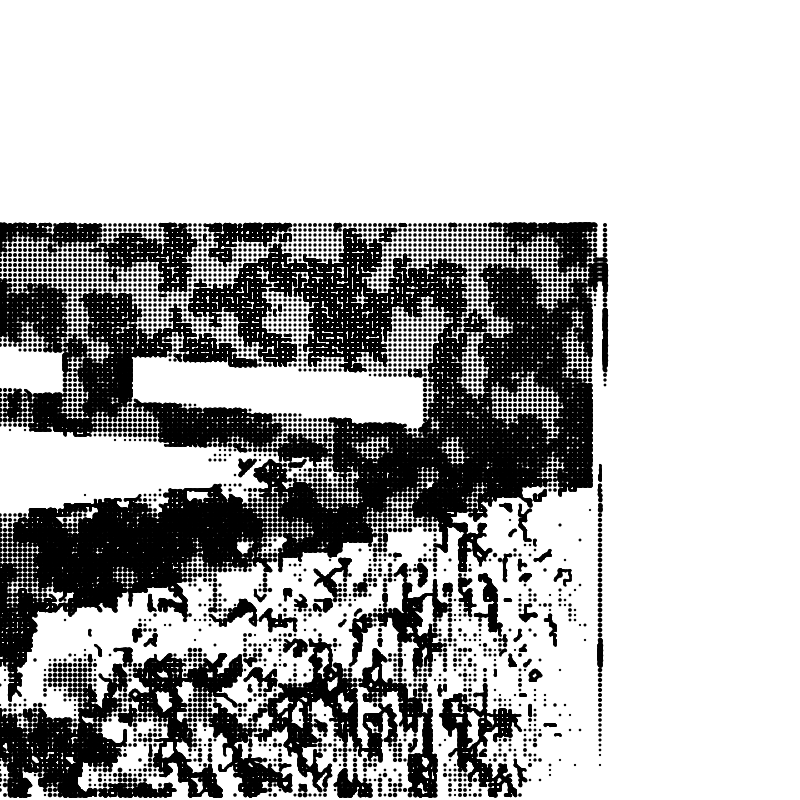
Pseudocode & Code for Checking Stock
Made with Mermaid.js and Vanilla HTML/CSS + JavaScript
Key Learning, Vanilla Constraints
Building with Node.js and Vanilla HTML/CSS instead of a framework enforced a deep understanding of the fundamentals and produced the raw Y2K aesthetic the brand demanded.
Key Learning, AI-Assisted Iteration
Developing before AI tooling was widespread meant the architecture was sound before Gemini and Cursor accelerated the final iteration, the foundation never had to be rethought.
Key Learning, Diagram-First Planning
Writing the pseudocode and Mermaid flow before touching the implementation forced clarity around stock-check state transitions and cart logic, decisions that would have been expensive to change later.
WHY
Four decisions that made the site feel like the brand.
Vanilla JS over React
Frameworks smooth edges. N1ghtterrors' edge needed to stay. The architecture had to feel like the clothes: nothing processed, nothing softened.
Unconventional nav
A standard menu would have made the site read as e-commerce. Post-testing copy fixed discoverability without touching the layout. Brand fidelity won.
Film grain and sway animation
Every animation was chosen to match the brand register: abrupt, textured, unresolved. Motion communicates what copy cannot.
Stripe plus Supabase
Shopify and Squarespace impose template logic on the brand experience. Full-stack control meant the purchase flow could match the site, not fight it.
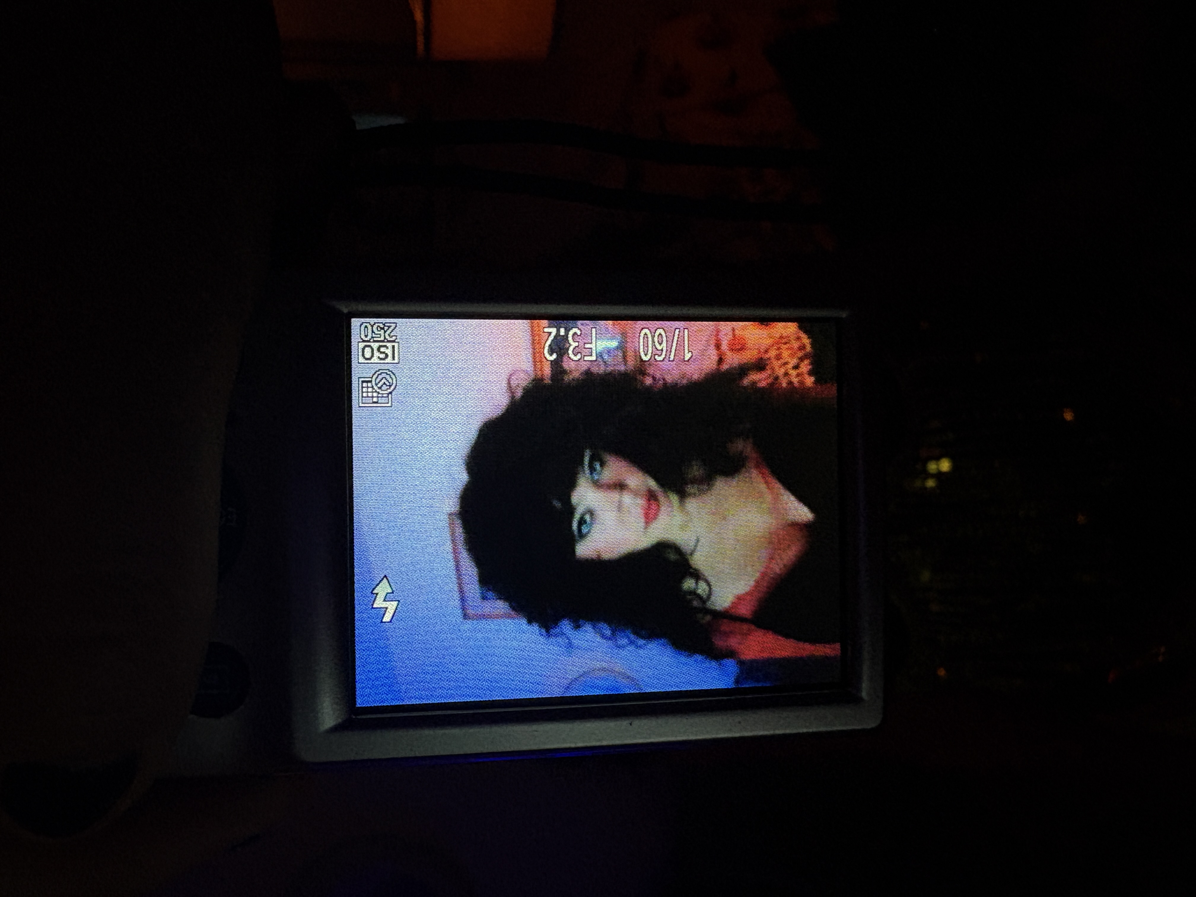
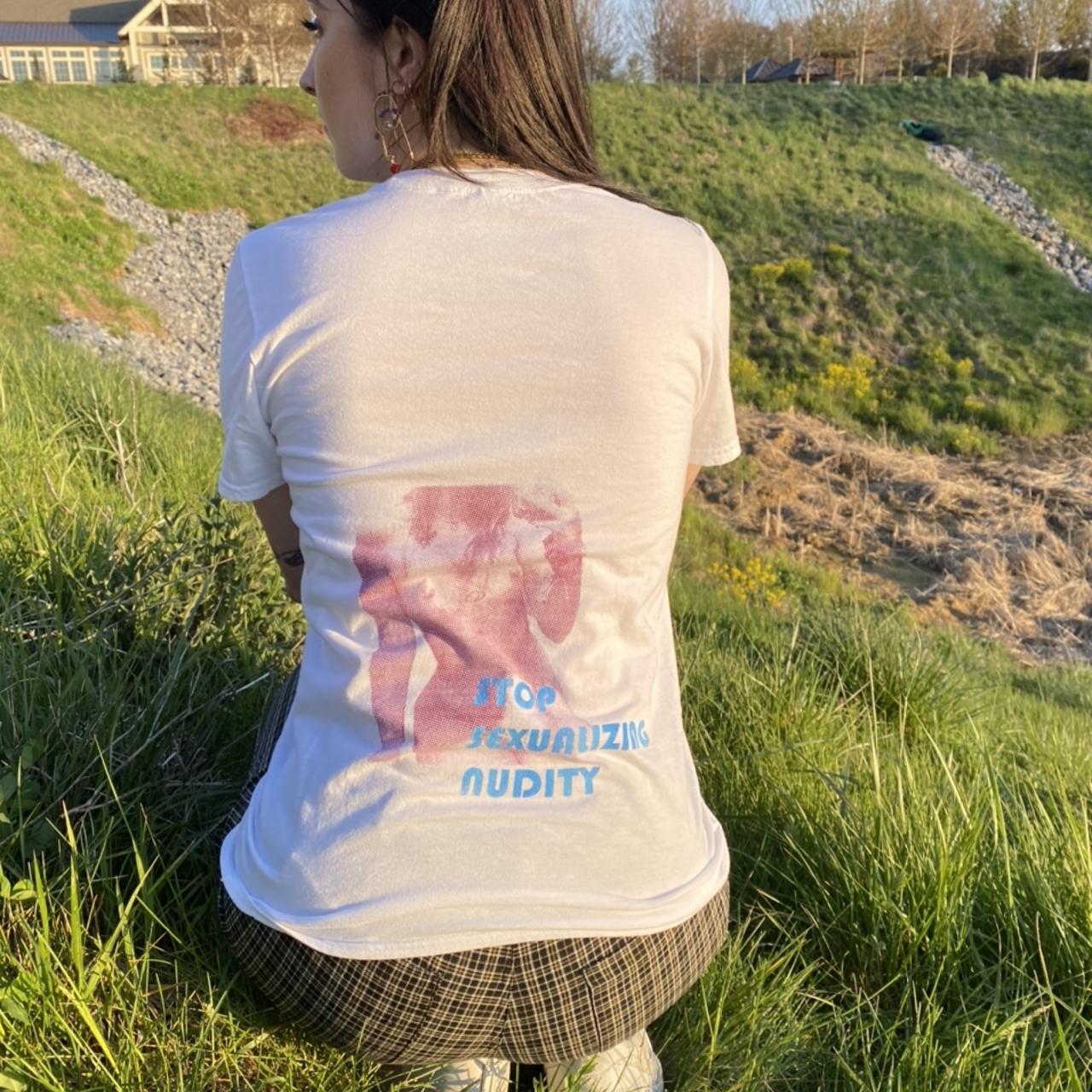
GALLERY
Prints and Photography
Taken with Fujifilm XT-30
IMPACT
A live site that the band actively uses and promotes.
50%
of launch inventory sold in week one
38%
of users needed a navigation cue. Fixed post-testing without a layout change.
0
redesign requests after delivery
WHAT I LEARNED
- 1
Brand fidelity over personal style
N1ghtterrors has a specific visual language, raw, nocturnal, confrontational. The job was to serve that language, not impose my own aesthetic. Learning when to disappear as a designer is as important as knowing when to lead.
- 2
Motion is meaning
Every animation on the site was chosen to feel like the music: abrupt, textured, unresolved. Motion that matches the emotional register of the brand communicates something copy never can.
- 3
Shipped work teaches what mockups don't
Seeing the site live on real devices, in real contexts, revealed edge cases no Figma frame anticipates. Building and shipping is the fastest feedback loop available.
CONSIDERATIONS
Brand Fidelity
50% of inventory sold in week one. The site felt like the brand — not a storefront with a dark theme applied.
Performance
Mobile load time was the critical failure point. Lazy-loading the video and grain layers resolved drop-off for mobile users.
Navigation Clarity
38% of users didn't recognise the menu as clickable until prompted. A few lines of copy fixed it without touching the layout.
Engagement
0 redesign requests after delivery. The visual language matched the brand's register on the first pass.
Tradeoff made
Unconventional navigation was chosen over standard menu patterns. The gain: a site that felt genuinely like the brand, not a template with a dark theme applied. The cost: the menu wasn't immediately discoverable and needed post-testing copy fixes to surface the entry point without breaking the aesthetic. That fix was a few lines of copy, not a layout change — which confirmed the core direction was right. Discoverability was a solvable problem. Sacrificing the brand register would not have been.
For the next iteration, navigation affordance gets resolved in the design phase, not fixed post-launch with copy. The site earned its strangeness. It just needed cleaner entry points.
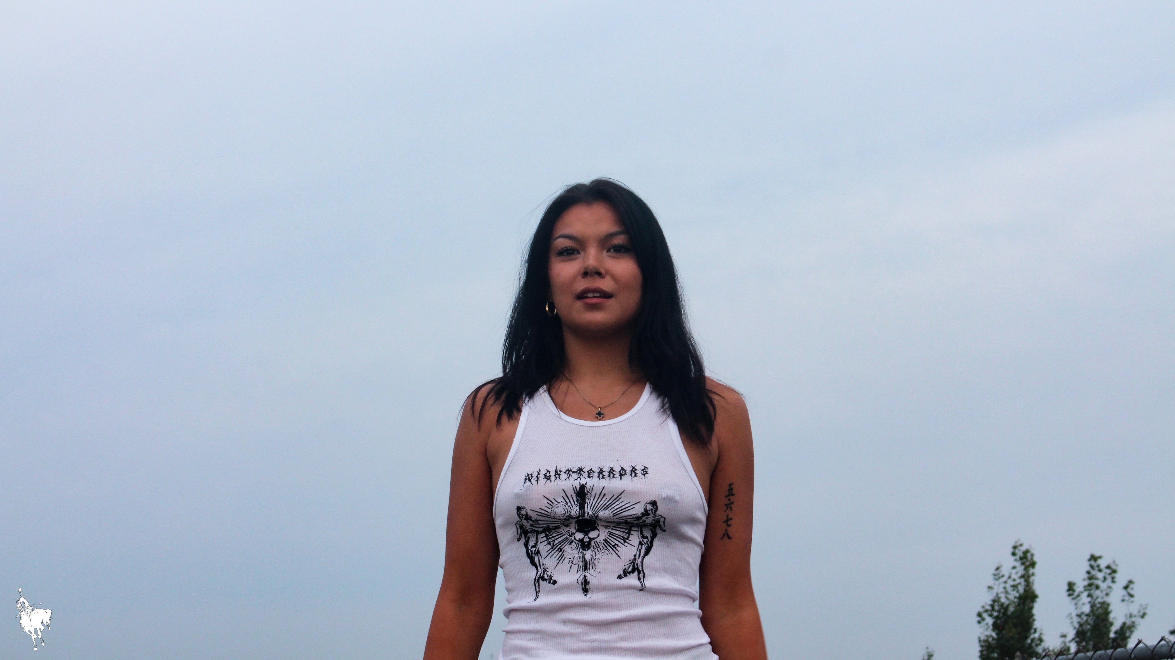
Early Shirt Iterations
Taken with Canon Rebel
more in product-design
view all →