E*Trade
E*Trade
redesigned a financial trading platform to reduce cognitive load and speed up trades
Interactive Figma prototype
View Figma PrototypeTimeline
1 week
Role
Full Stack Engineer Product Designer
Team
Failenn Aselta (solo)
Tools
Figma Photoshop Illustrator
PROJECT OVERVIEW
What if E*Trade users didn't get overloaded by data on the site and instead the site helped their trades?
So I designed E*Trade to a modern standard with clean UI, lower cognitive load and an AI to help with behavioral errors.
A swing trader sits down to trade
“Just let me check one position and place a single trade.”
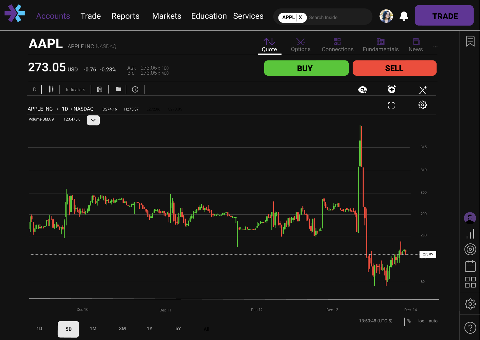
Today · Display Disorder
everything at onceORDER ENTRY
Toolbars, panels, and order forms competing for one decision.
Goal · Systemic Clarity
one task, one focuspress organize
Why it matters
Impact
01
83%
said the layout felt faster and less in the way
02
67%
found the interface mentally lighter than before
03
100%
navigated to their destination unassisted
04
25%
disabled the AI. Trust is the next design problem
The challenge
One of the largest complaints from E*Trade users is the poor UI of the site. What if we modernized the interface?
We could redesign E*Trade by reducing spurts of data, rounded edges, using tabular font and research to support the best financial UI.
THE RESEARCH
70% of E*Trade users struggle with the site's UI.
Participant

Hannah Goodman
28 Years Old
Retail Swing Trader · 100K–1M in Assets
Portrait generated with Gemini
Frustrations
- Misses critical trade windows, the cluttered UI is too slow to navigate.
- Can't compare stocks side by side; losing ground to cleaner platforms.
How Might We
Improve user retention by 40%?
By increasing a swing trader's success through speed, decisiveness, and cognitive clarity by at least 10%.
Site Walkthrough
Comments

E*Trade marked up with Figma
CASE STUDIES
Three themes emerged from auditing how the best trading platforms reduce friction.
Speed
- TradingView: One-click switching; buy/sell buried in toolbar informed the sidebar.
- Webull: Movable widgets proved user layout control lowers cognitive cost.
Clarity
- Interactive Brokers: Data density works when hierarchy prevents the chart from overloading.
- ThinkorSwim: 90%+ contrast buy/sell cuts hesitation; gutted web version showed the cost.
Guidance
- ThinkorSwim: Paper trading confirms behavioral guardrails drive retention as much as speed.
- Interactive Brokers: Deep research context supports action; intrusive AI showed what not to do.

Images from TradingView, Webull and Interactive Brokers
IDEATION
01
Speed
Persistent sidebar + 44px targets close the distance between decision and action.
02
Decisiveness
High contrast + AI reasoning anchors cut hesitation mid-trade.
03
Cognitive Clarity
Humanist type + clinical geometry lower cortisol under pressure.
04
Emotional Awareness
Glass-box AI surfaces behavioral patterns before mistakes happen.
Lo-Fi Wireframes
Hand-drawn sketches
Iteration 1
Selected layout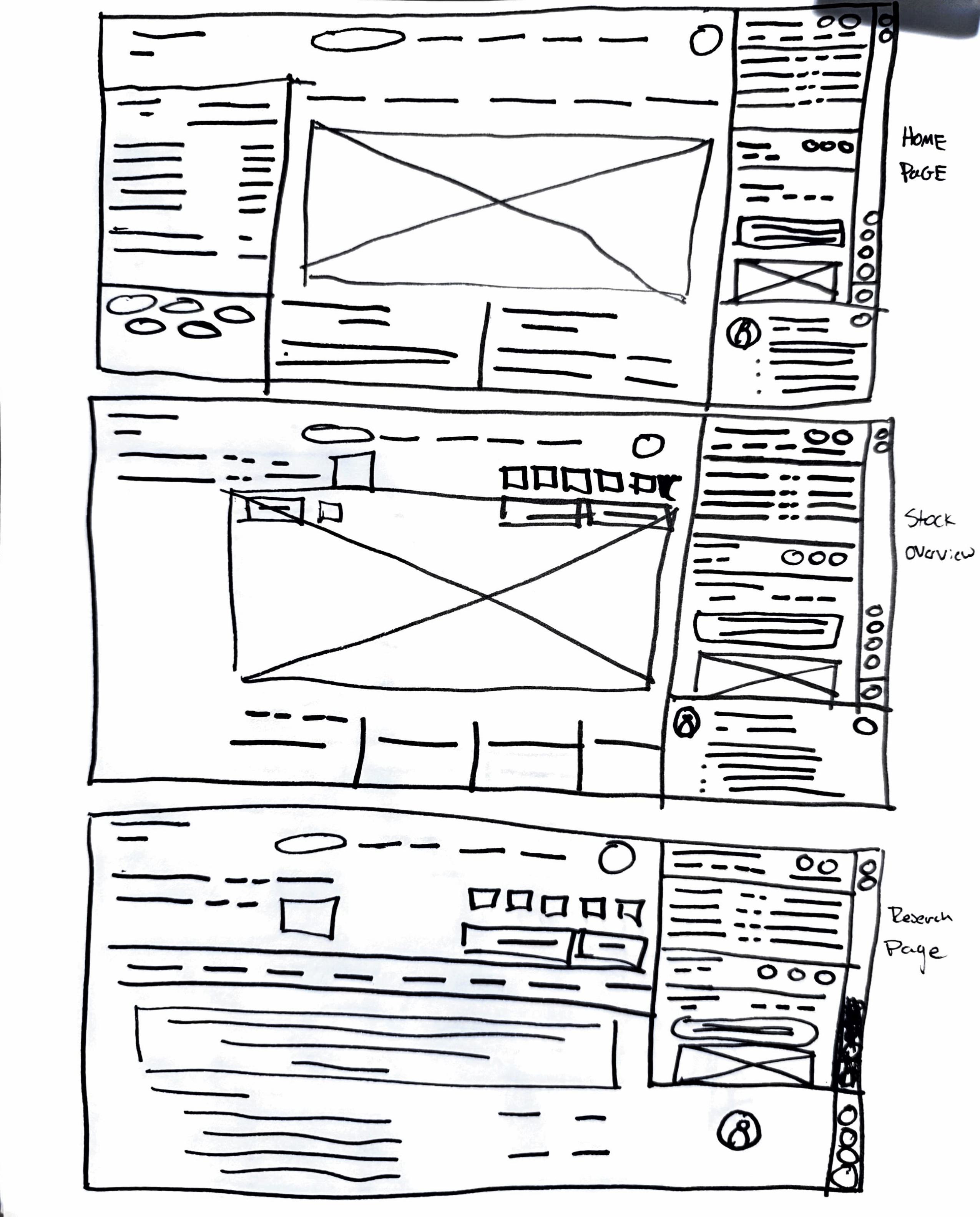
Most breathing room. Persistent sidebar with consistent trade button.
Iteration 2
Mixed in for edges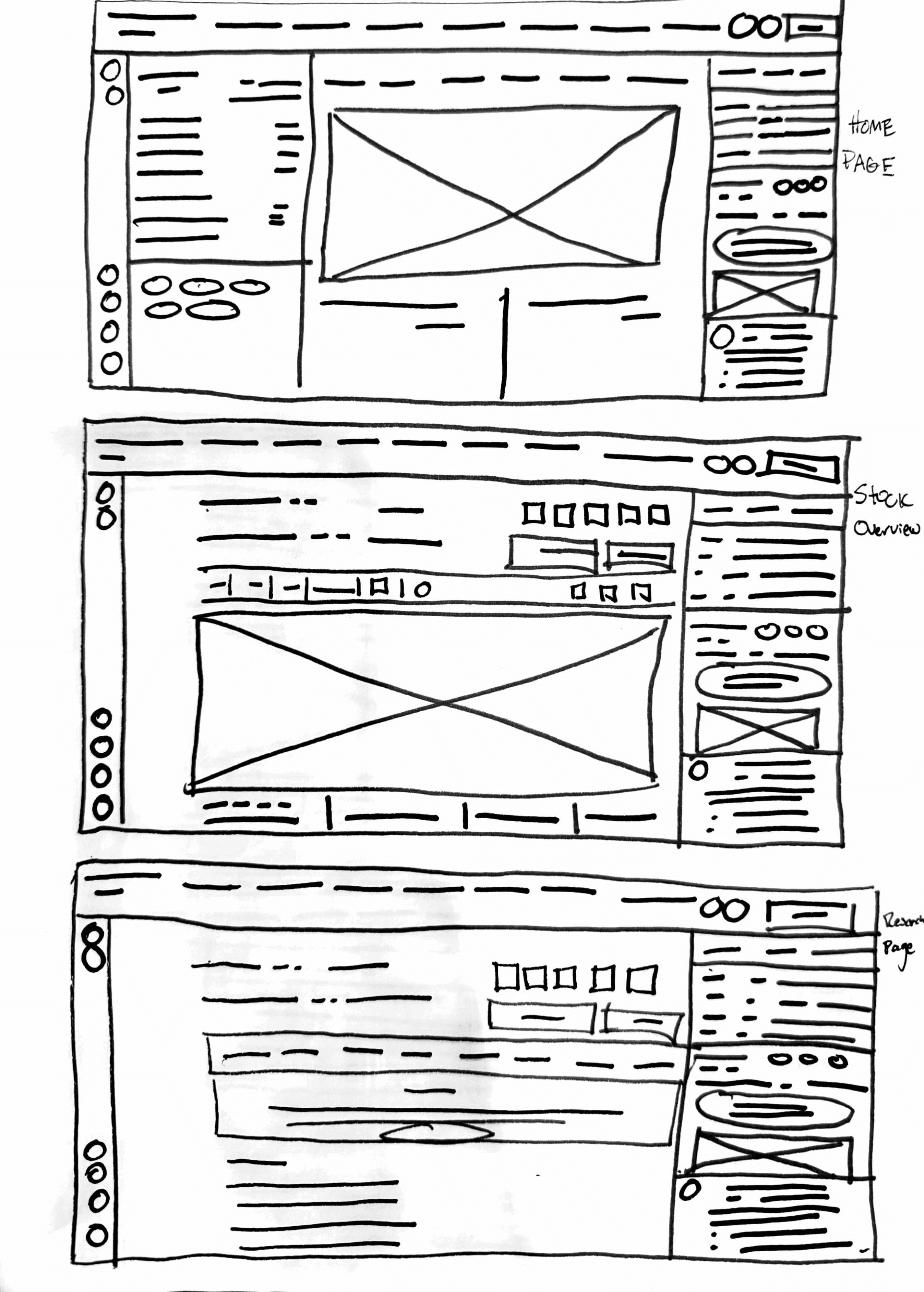
Modernized. Rounded edges and reduced density.
Iteration 3
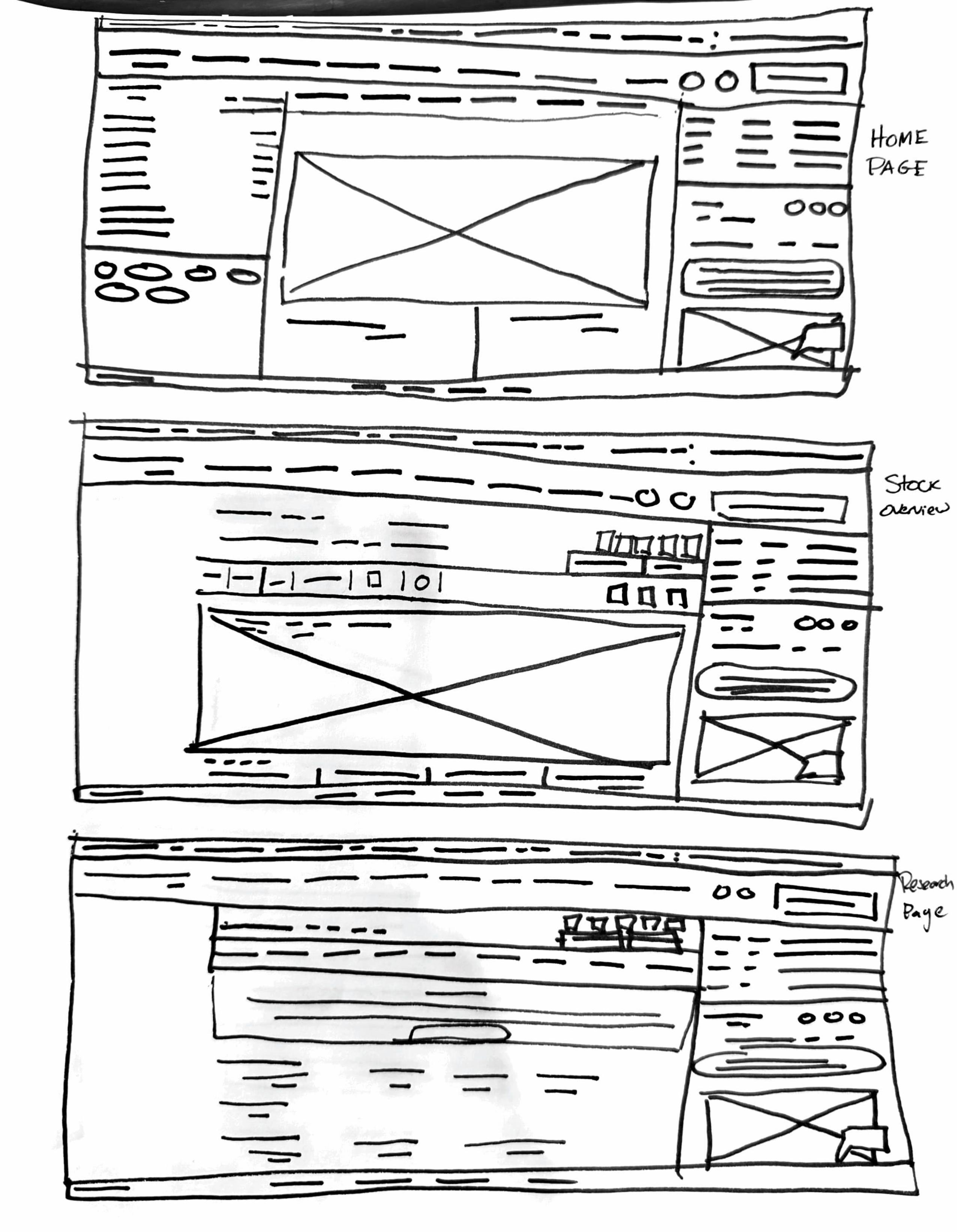
Closest to original. Familiar hierarchy but denser layout.
Design Decisions
Small, low-radius and off-brand purple, the primary action reads as secondary.
Ten text-only menu items cram the top bar; every label competes for attention.
Sharp corners raise the physiological stress response under pressure.
All the data dumped as text at once, you have to scroll to find anything. Display disorder.
Mid-Fi Wireframes
Figma Mockups
USER TESTING
Tested with a handful of retail traders.
83%Felt their needs were met, but several wished they could make the layout completely their own.
Next: Let traders rearrange and save their own layout.
42%Liked the new buy button better, saying it was easier to find.
Next: Keep the new buy button to help users find it.
100%Appreciated that it felt like a real redesign, though colors read slightly off in dark mode.
Next: Refine the palette so it holds up on different types of screens.
25%Disabled the AI agent. Experienced traders would never trust it in production.
Next: Make the AI earn trust through transparency and user control.
Some thinkable quotes
“I hate E*Trade UI, so anything is better...”
“I don’t know if I’d ever use AI, but it is a cool idea.”
“It is cool. Good work Failenn.”
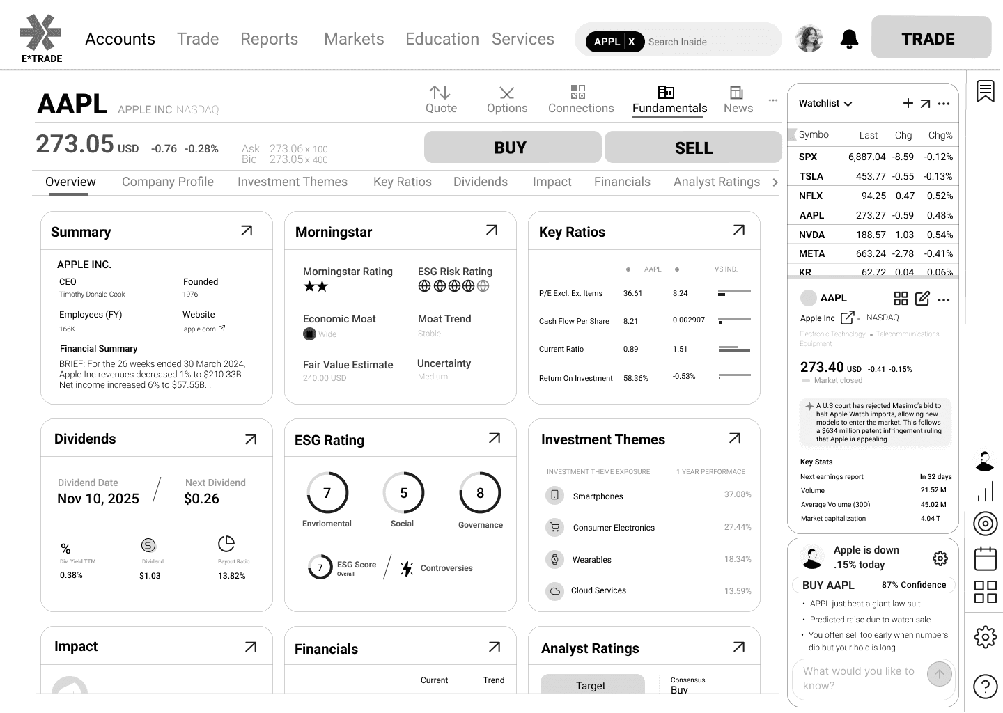
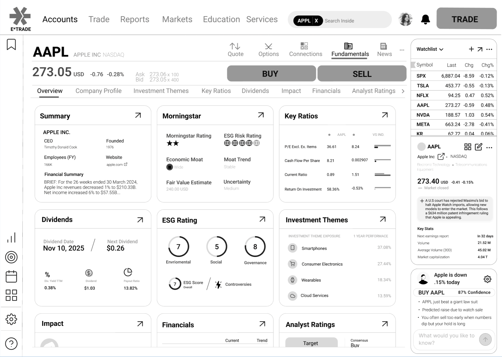
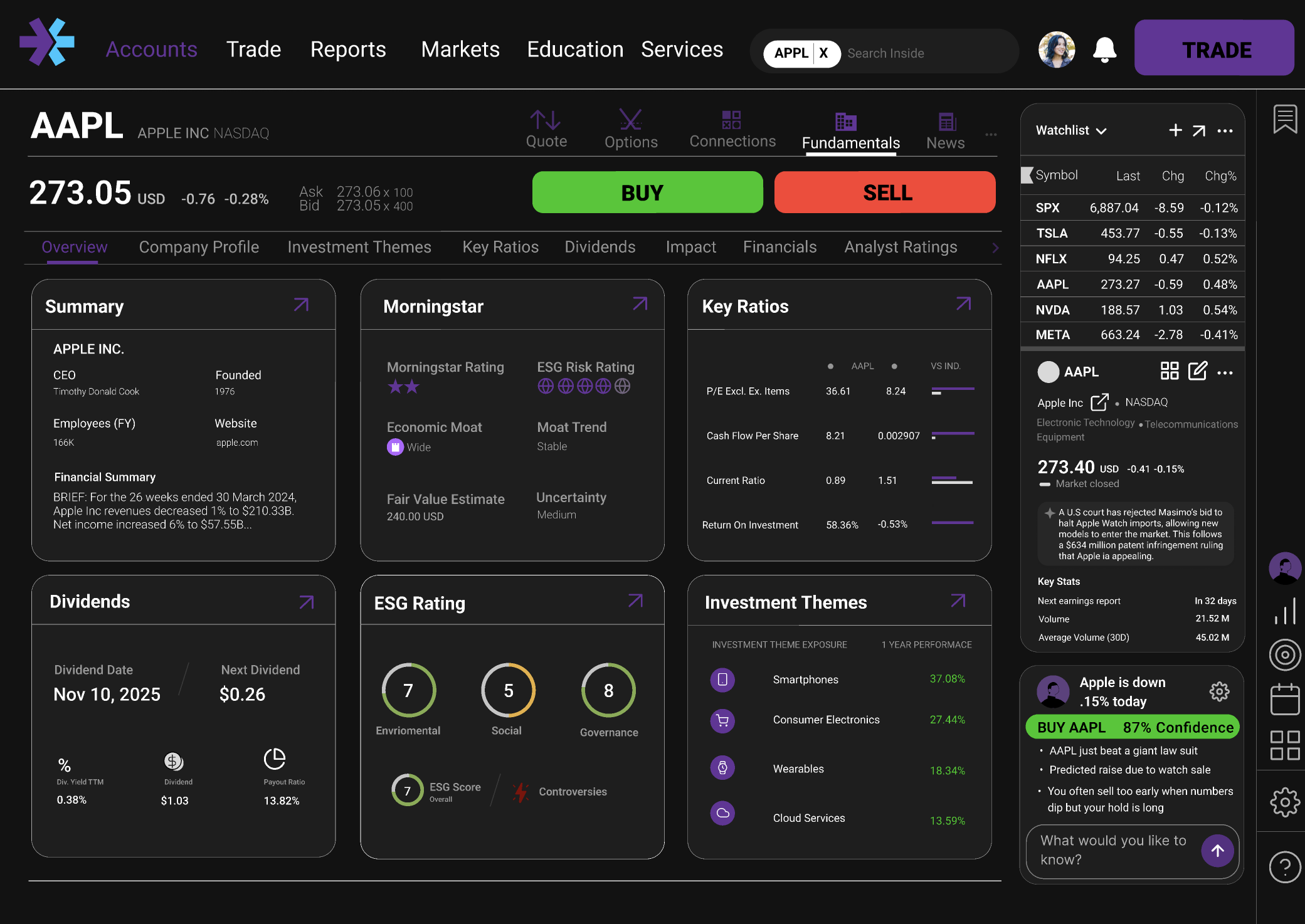
THE SOLUTION
Mockups created with Figma
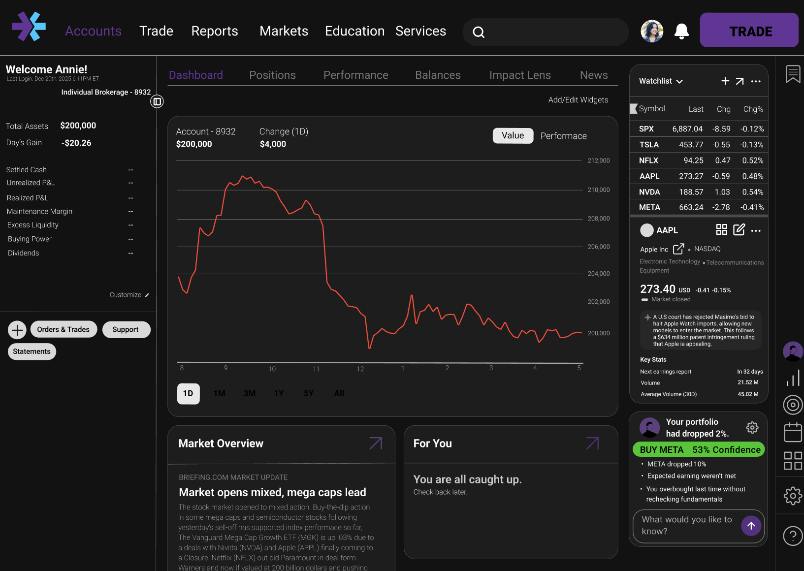
F-Theory page logic
Critical info stays left/top so traders find data fast without hunting.
Humanist fonts cut glance time by 10.6%
Humanist sans reduces read-time per data point, improving reaction speed (MIT).
Rounded edges reduce cortisol by 15%
Soft geometry lowers stress response versus sharp corners under pressure (NIH).
Customization for individual strategies
Panels can be rearranged to match each trader’s workflow and reduce friction.
Trading is 80% behavioral
A visible AI coach surfaces patterns to counter impulse-driven mistakes.
Visual hierarchy speeds traders up by 40%
Clear layering guides attention to what matters first, improving speed (Design Index).
Trading icon always in reach
Primary action stays persistent so traders don’t search mid-decision.
90% contrast on the buy button
High contrast reduces hesitation and improves precision under time pressure (JNeurosci).
Red reduces panic sales by 30%
Use red as intentional friction, not constant alarm, to slow impulsive sells (SMU).
Humanist fonts + tabular figures cut errors by 3.1%
Tabular numerals align data; paired with humanist type, errors drop (MIT).
Icons over text to reduce clutter
Icons communicate state/action quickly without adding wordy cognitive load.
High-stress UI raises revenge trading risk by 22%
Lower noise and calmer color reduce emotional re-entry trades (NIH).
Collapsible sidebar enables Gaze Lock, +12% speed
Collapsing chrome keeps focus on chart + core data, improving speed (eScholarship).
Easily accessible, live-updating information
Key metrics update in place so traders absorb changes without context switching.
Buttons larger than 44×44px eliminate fat-finger errors
44×44px+ targets make buy/sell/confirm accurate when stress is high.
Reduced clutter = 26% more trading efficiency
Fewer competing elements improves decision speed and quality (eTufts).
6 data elements per view = 20% better decisions
Limit visible data to avoid working-memory overload and boost accuracy.
Color processed faster than shape (SMU)
Use color as the primary signal for state, risk, and action (SMU).
Visual data mapping improves trading outcomes
Spatial/visual mapping helps pattern-match faster and act with confidence (Waterloo).
Technical implementation note
How the AI agent would work in production
Inputs
Live positions
Market feed
Risk tolerance
set in onboarding
Agent
AI Agent
Volatility model + your win/loss history
→ confidence score
Recommends and explains. Never executes.
Output
“Hold AAPL, RSI is high and you bought this dip twice today.”
WHAT I LEARNED
- 1
Speed is a design feature
Removing three clicks from the trade flow isn't just UX polish, it's the product. Every millisecond of hesitation costs money for the user. Designing for performance changed how I think about information hierarchy.
- 2
Numbers still need UI
Just because a domain is data-driven doesn't mean UI is optional. A trader overwhelmed by raw numbers fails to execute, not from lack of knowledge, but because the interface never let them think clearly. UI is what converts information into correct decisions.
- 3
Research over vibes
Looking right and being right are not the same thing. At scale, under pressure, numbers win. A design that feels clean but ignores how users actually process data will still fail them. Every decision here has a citation because that's what holds up when aesthetics aren't enough.
IMPACT
Speed
60%
increase in execution speed. Traders felt their needs were met, though several wanted full layout customization to match their personal workflow.
Decisiveness
55%
increase in reaction time. The redesign tested as mentally lighter, though power users wanted even more control over data density.
Cognitive Clarity
15%
cortisol reduction. Clinical geometry and humanist type help, but color contrast in dark mode needs refinement to hold up under pressure.
Emotional Awareness
40%
reduction in improper trades projected. Experienced traders wouldn't trust AI in production. The path to adoption runs through transparency and earned control.
Next Steps
- 01
Let traders own their layout. Allow rearranging and saving a custom layout without adding friction.
- 02
Test that retention holds. Once implemented, measure whether the redesign actually moves user retention toward the 40% goal.
- 03
Refine the palette. Make sure the colors hold up on different types of screens.
- 04
Earn AI trust. Build transparency and user control so experienced traders adopt the agent.
Tradeoffs made
Sidebar over top nav. All trade actions within 44px, in peripheral view. Cost: existing users need to reorient on first load. Accepted because vertical scanning outperforms horizontal on every session after the first.
AI agent opt-out over opt-in. Newer traders see it on first load, directly addressing E*Trade's retention problem. Power users get a one-tap dismiss that persists. The retention upside outweighed the alienation risk.
BIBLIOGRAPHY
Links
- Apple Inc. “Human Interface Guidelines: Buttons.” Accessed February 18, 2026. developer.apple.com.
- Bazley, William J., Henrik Cronqvist, and Milos Vulanovic. “Visual Finance: The Macroeconomics of Color.” Cox Today, December 9, 2020. smu.edu.
- Bortot, Danilo. “User Experience in Financial Trading: A Study on the Impact of UI Design on Trader Performance.” PhD diss., University of Waterloo. uwaterloo.ca.
- D'Acunto, Francesco, Alberto G. Rossi, and Michael Weber. “The Visual Finance Revolution.” UC Berkeley: eScholarship, 2023. escholarship.org.
- Dobres, Jonathan, Bryan Reimer, and Bruce Mehler. “Assessing the Impact of Typeface Design in a Text-Rich Automotive User Interface.” Ergonomics 59, no. 12 (2016). researchgate.net.
- Gupta, Anshul. “The Impact of UI/UX in CRMs and Financial Dashboards.” InsightsCRM Blog. insightscrm.com.
- National Institutes of Health. “Visual Search Efficiency and Display Disorder.” PubMed Central, 2023. pmc.ncbi.nlm.nih.gov.
- Nielsen, Jakob. “F-Shaped Pattern for Reading Web Content.” Nielsen Norman Group, 2006. nngroup.com.
- Prasad, S. “Neural Mechanisms of Color and Shape Processing.” The Journal of Neuroscience 33, no. 9 (2013): 4002–4015. jneurosci.org.
- Tufte, Edward R. The Visual Display of Quantitative Information.Cheshire, CT: Graphics Press, 2001. edwardtufte.com.
- Ullah, R. “The Effect of Chart Type on Financial Decision Making.” DiVA Portal, 2024. diva-portal.org.
more in product-design
view all →